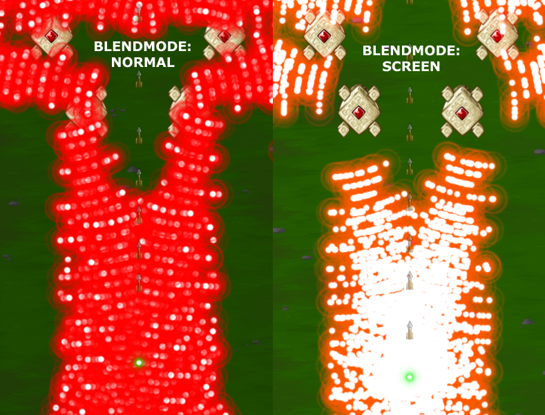
So the “Screen” blendmode is pretty cool. It makes the white parts of the bullets stick out above the colored glow. It doesn’t look so good on some dense patterns though; you mostly just see white and lose all the colors.
I’ll stick it in as an option, and players can decide which blendmode they prefer. It doesn’t seem to effect performance much.
I’ve also been playing around with particle effects, but I think I’ll not use any. They look cool, especially for enemy deaths, but I think they’re quite distracting in a game like this. I think I’ll just animate some of my usual circular explosions and blast waves.


I like the blendmode: screen, because it allows me to see where the bullet hitboxes are, which the blendmode: normal hides behind the red circles.
I think having it as an option is the right thing to do. Because only the white dots can actually be hit, the screen option would be very helpful in some of the more difficult boss battles!
So the green light is the fairy from zelda? A new character is here! :yay:
Since the bullets act as glowing objects they can be considered light sources. And the correct blend mode for light sources is the add mode. But hey, who cares about correctness as long as it looks good?