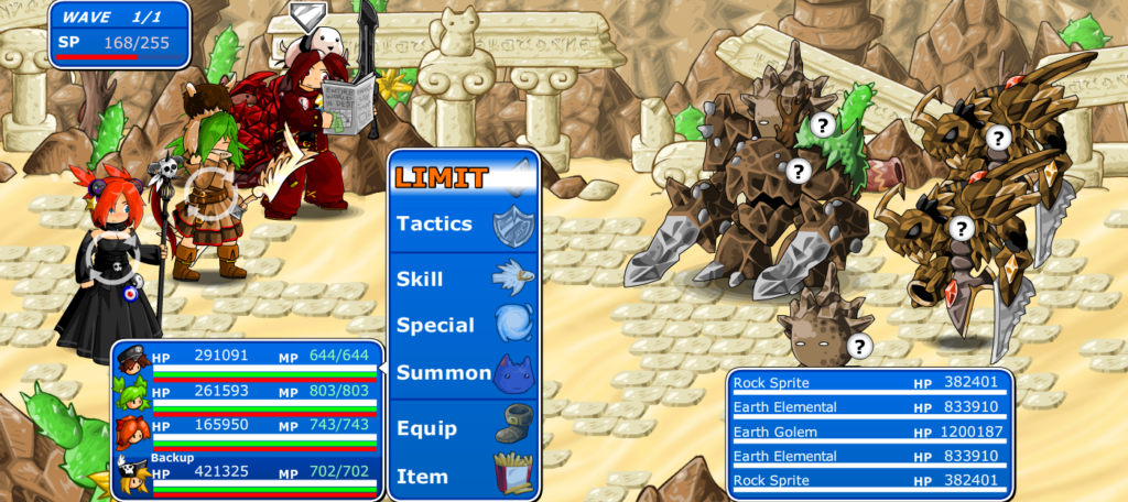
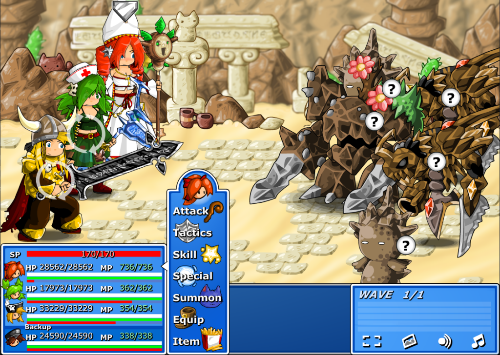
Hey guys, I’m making progress on the battle interface. It looks a lot more like EBF5 now! The 2nd image is the original layout, for comparison.
I guess I’ll include the option to change the UI window color, since that’s also a useful accessibility feature. The PC version won’t get most of the UI updates, as they are mainly for making the game play better on mobile.
Though the foe HP bars with more information could be helpful on PC too…


Old version is good enough,please don’t change it too MUCH:(
Ahhhhhhhhh, I pretty pretty like the old version, please don’t change it :(((((
the new interface is infinitely better than the original !
I honestly think it looks kind of ugly, but good change regardless!