
Hey guys, stupidly long phones are popular lately, and EBF5 has been a strictly 16:9 aspect ratio game until now, so a lot of people have been seeing black bars on mobile. This isn’t so bad on phones with an aspect ratio of 18:9, but when it gets to 20:9, you’re losing 25% of usable screen space!
Getting rid of the black bars has been the most requested feature on mobile (except maybe for cloud saving, which is also coming soon), so after some reluctance at first, I’ve finally decided to work on it. I’ve decided to support resolutions from 16:9 to 20:9, because that covers most high-end phones, and isn’t a crazy amount of work (at the moment it’s looking like about 5 or 6 days of work). I’m not doing taller tablet resolutions because that would require twice as much work, and tablets are much less popular (most of the GUI has been designed for widescreen, so I’m in no mood to redesign all of that). I also considered supporting 22:9, but that turned out to be awkward and looked worse than just having the black bars (the maps can’t be scaled to such a width without horrible distortion).
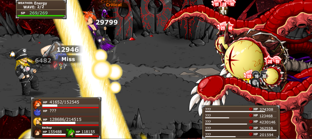
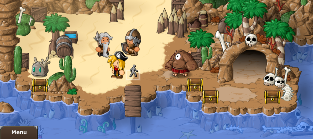
So what’s changing? Player, foe and spell animations that reach the edges of the screen have been extended to reach further, and battle backgrounds are being extended too. The world map has been zoomed in a bit, and the menu now requires a button press to open. This has the advantage of making the map easier to navigate, as the tiles are noticeably bigger and easier to tap.
There’s also an option to lock the game to 16:9, if you prefer that for whatever reason. But I think the extra width looks pretty cool.
Is it worth a week of work? Probably not. But it’s a novel challenge and has been more fun to do than some of the other mobile features.
Why not just add a stupid image banner on the side of stupid long phone screen?
15-25% of the screen isn’t being used to play the game problably