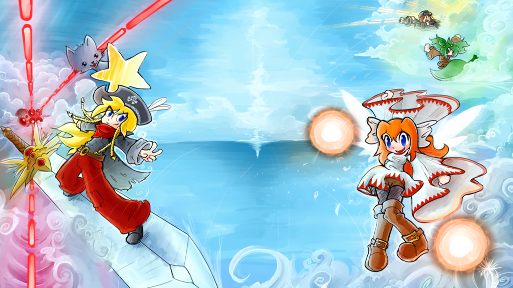
Hay guys, the Bullet Heaven 2 promotional art is pretty much finished. What do you think?
This will be used in various types of icons and images around Steam, and also as the menu background in-game. The characters can be moved around, so this layout isn’t fixed.
Art’s by ptolemaiosLS again. (ptolemaiosls.deviantart.com/)

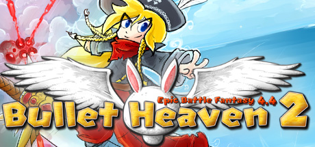
Here’s an example of how the image might be used on Steam:


There are totally not enough bullets… I thought it’s called “Bullet Heaven”
Dunno if its just me, but the cropped background with the logo in front looks a bit pixelated. Dunno if its the compression or not, but could use a bit of smoothing I guess.
Yeah, I think Photoshop messed that one up when I rotated it. It’s not the final thing though.
Looks good. I like the art-style used when making promotional art, it’s pretty rad just like in EBF4. The Steam image looks fine, but I think there should be another enemy in the middle of the full picture or something, so it doesn’t look like Natalie is just there to look pretty :smirk: . Maybe Anna and Lance could be a little closer to the screen, but other than that it seems pretty decent. The colors are very vibrant as well, 8/10 :bacon: .