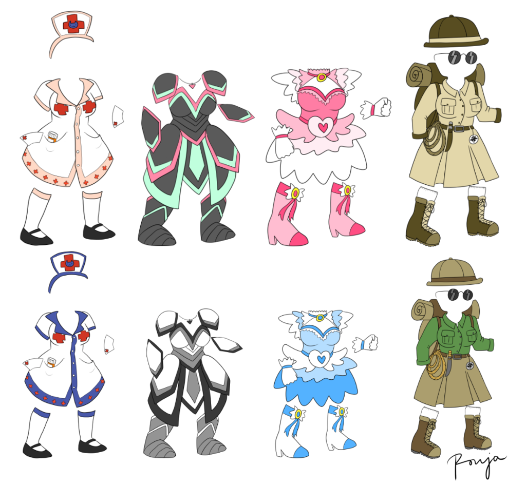
I got Ronja to draw armor ideas for EBF5, since mine in the past haven’t always been the most creative. You can find more of her stuff on DeviantArt, but I’ll also be posting a lot of her work here.
Which design is your favourite?


I got Ronja to draw armor ideas for EBF5, since mine in the past haven’t always been the most creative. You can find more of her stuff on DeviantArt, but I’ll also be posting a lot of her work here.
Which design is your favourite?

The best for me is the monochrome dress. It is really unique :love:
So many memories from madoka magica… You had better put the magical girl outfit in the game or else! (or else nothing but seriously, put that in the game please.)
what % of the game is finnished?
The plate armour reminds me of Jude Mathis’ outfit from Tales of Xillia; at least the top one does. It must be the colours.
Anyway, the plate armour is my favourite, but I really like the magical girl and the explorer armours, too!
Hey, just wondering, are you a madoka magicka Fan? Because that one is my favorite. The second from the right.
Totaly different in details , pink is just a standard color for magical girls
Really liking the plate armor and the magical girl outfits :0
As a bearer of a few fetishes I really wish I liked the nurse outfits more, but something in their coloring doesn’t click in my brain.
They are not purely white, that it.
And as for now, my favorite is the explorer outfit! 😀
Either version of the explorer outfit.
My favorite is the top version of the second armor. :smirk:
Also, I see there are elbow bands or sleeves on all of them… Couldn’t(/would take too long to) fix the joints…?
They all look great! However, I personally don’t like pink much. I’m assuming the top row is the Natz variant, and the bottom is the Anna variant? I would use a bit less pink, but I love the designs- especially the Plate Armor suit. Hope to see more from Ronja, too!
I guess only one of each column will be chosen, because having both models would be kind of unoriginal, unless they count as the same armor and you can choose the colour ingame. What I try to say is that I’d rather have, let’s say,15 different outfits, than 20 consisting of 10 original ones and 10 colour variations.
That said, from the first row I prefer nurse and pink dress. And from the second row, armour and explorer outfit.
Anyways, awesome art! :yay:
I’d have to say my favorite is the second column, the plate mail like armor. Very nicely designed, and actually looks protective gear.
Its great to see you are getting some concept art from Ronja, always nice to expand your selection of ideas and styles.
umm… all of them?
But seriously:
top, second from the right is my favorite, and of each alternate, top,top,bottom,bottom.
Like! :phone2:
Omg ! Number four remember me League of Explorers (Hearthstone) and a Winston skin (Overwatch) !!! Great stuff :stars: